Information Management Power BI Templates
These report wireframe screens were for board directors to view internal data, metrics and analytics, generated from PowerBI reports.
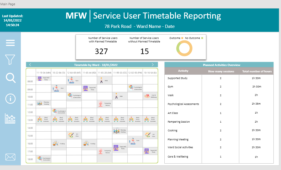
Meaningful Week is an application where patients and staff are able to book activities during their residency in the hospital.
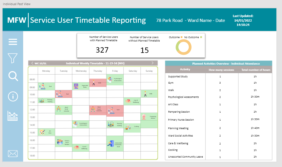
The reports show a ward activity timetable with a dashboard overview of figures, which the user could delve into for more detailed data.
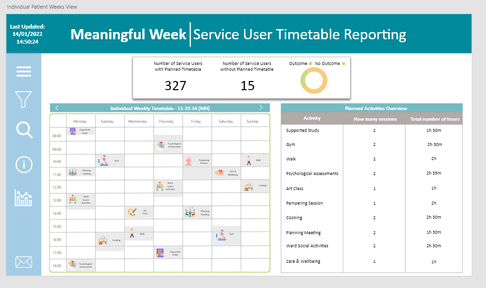
The user can access an individual weekly timetable by searching via patient.
By clicking the left arrow, it displayed the patient’s past timetable
Green = patient attended.
Red = they did not attend.
The data is also represented in a structured format on the right table; it showed the average hours spent in actibity sessions for the individual patient.
Header titles have been iterated in a few layouts as users preferred a decluttered title header.
Burger menu on the side bar generates dropdown tabs for user to filter their search.
The titles and the colours for the drop down menus, were shown in different variations via A/B testing for the users.
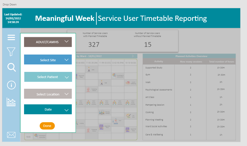
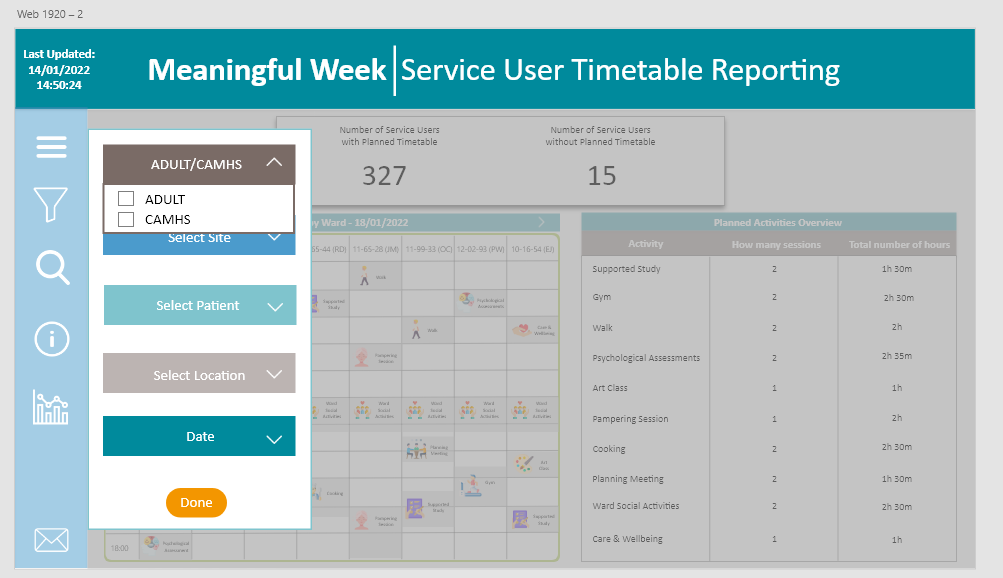
Users advised that a date range filter be added, to specify their data. This was subsequently added with a daily, weekly and monthly view.

The ‘i’ provides speech mark guidance and useful tips, allowing users to understand what the sections mean. This was requested by users.
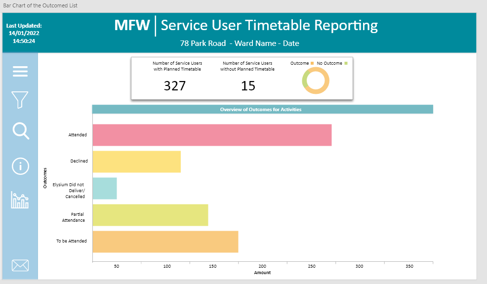
The bar chart is generated from clicking on the Outcome/No Outcome pie chart within the dashboard, providing a detailed overview.
CEO Dashboard
The CEO Dashboard was a requirement for all Directors to have access to key information within their reach and on the go.
The metrics had to be accessible, with a break down into key components to identify trends or key areas of improvement across the business.
Each director had a different set of objectives, which was identified through research; they were added onto one dashboard and broken down into tabs.


Colour MFW: company guideline colour scheme and used at both 100% and 50% opacity for muted tones to make the colours complimentary.
Typography/Font: Calibri - clear and concise; all other reports use this font and consistency throughout data reporting and metrics is vital.
Colour CEO: slight differentiation between the MFW reports, but still in keeping with company branding guidelines, like all applications for the company.