
Android E-Commerce Projects
Another self project on an existing retailer, understanding user needs and designing alternative solutions, on an Android interface.

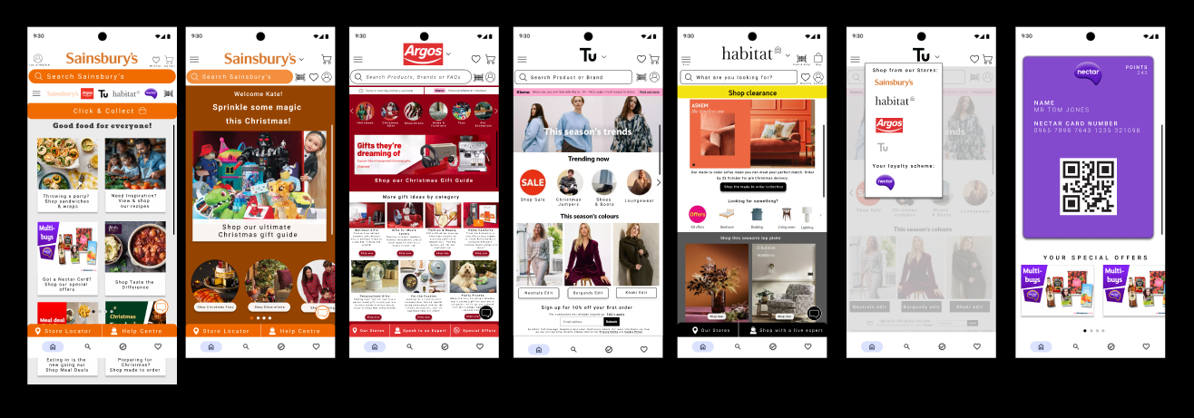
Original Designs


Discovery
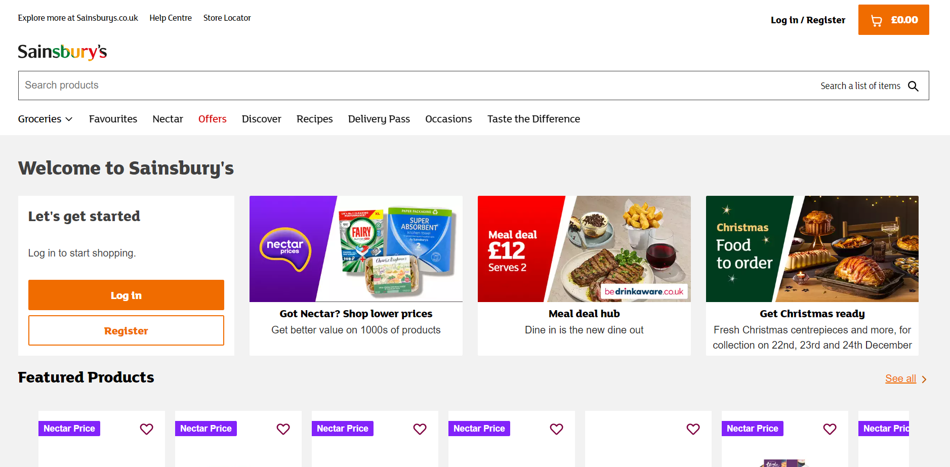
A survey fed back that the website immediately hit them with products and that it was a little bit overwhelming.
They wanted to see less on screen and to have items under category as well; this has been translated below.
Another issue that was raised by users was how to get to the other brands; there was only ever the option to do so from the main Sainsbury’s page. Once the user was on another branded page like Tu, Habitat, Argos or Nectar, there was no option or navigation to the other brands/stores.
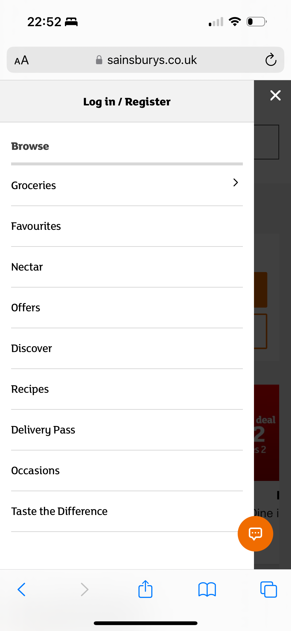
The webpage interface displays two options to log in and register; the user stated that this was not necessary and that one small log in option on the top left or right of the screen would be enough.
A Nectar card visible within the app showing points and available offers with the points would also be beneficial.

New Wireframe Designs


Research
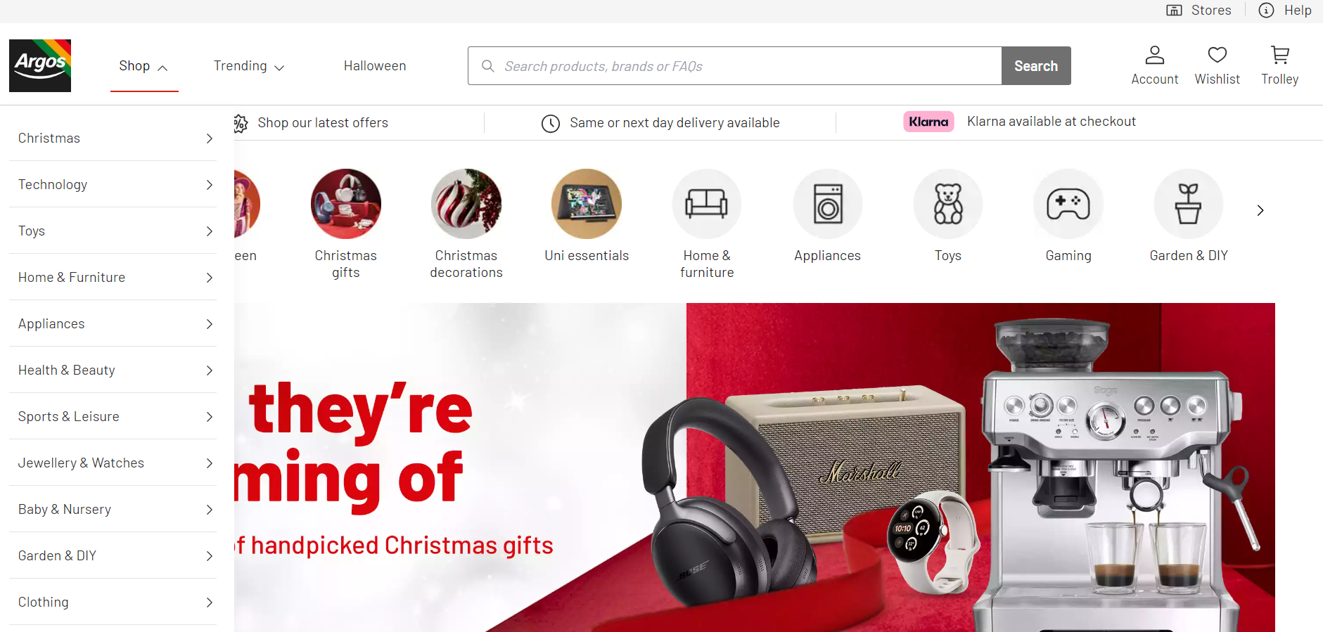
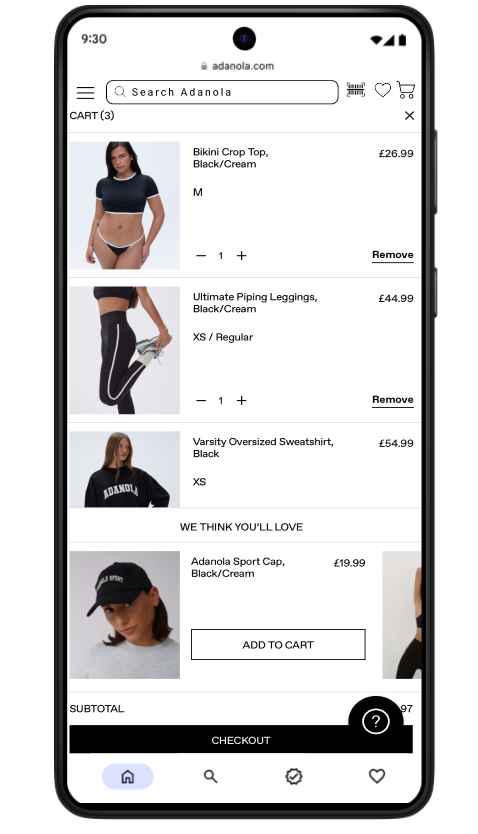
This retailer does not have it’s own app, its customers fed back that the navigation and functionality was slightly confusing.
One of the main issues felt was that when they added items to their cart, the price was obstructed by a question marked action bot. The only way for them to know the subtotal was to click the checkout button, view the price and then press back to amend their cart. The widget was in a fixed position.
Another issue arisen was that the “we think you’ll love” suggested items section was in the way and prioritised the subtotal section. Customers found this selling technique to be intrusive and annoying. Consumers also found that they would accidentally add items in the suggested area to their bag as the button is close to check out.
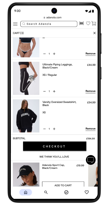
The left UI is original and the right is a slight rework of the original model. The subtotal is in clear view with the customer’s option to proceed to checkout or alter their shopping cart. “We think you’ll love” is still in view to show that it is a suggestion and not so forceful for the customer.
Future Plans
A strong recommendation would be to have an app for this company for simple navigation.
A wishlist icon on the bottom navigation.
A way to search a product via an image and barcode.
An icon at on bottom navigation of the screen for rewards and loyalty scheme.
Colour scheme alteration
Simple search functionality with keywords.
Further card sorting to define categories.
(Unpaid work created for personal development)