

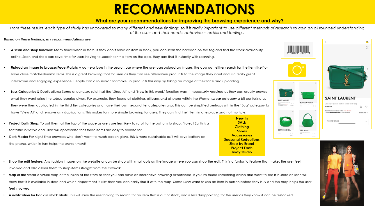
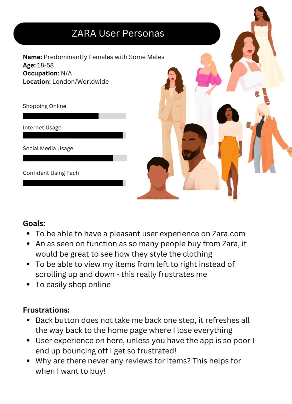
E-Commerce & Retail
These self project designs were based on E-Commerce & Retail apps, seeing if improvements can be made to existing applications, to enhance their user experience.
Discovery
- Competitive analysis is always the best way to compare the pluses and deltas of multiple e-commerce apps.
- As part of research, user interviews understood general shopping habits as well as their initial thoughts on the company website. The target audience ranged in age as their demographic is vast; Selfridges caters to all.
- Users wanted a more interactive virtual experience, to be more enticing and simple navigation with the categories.
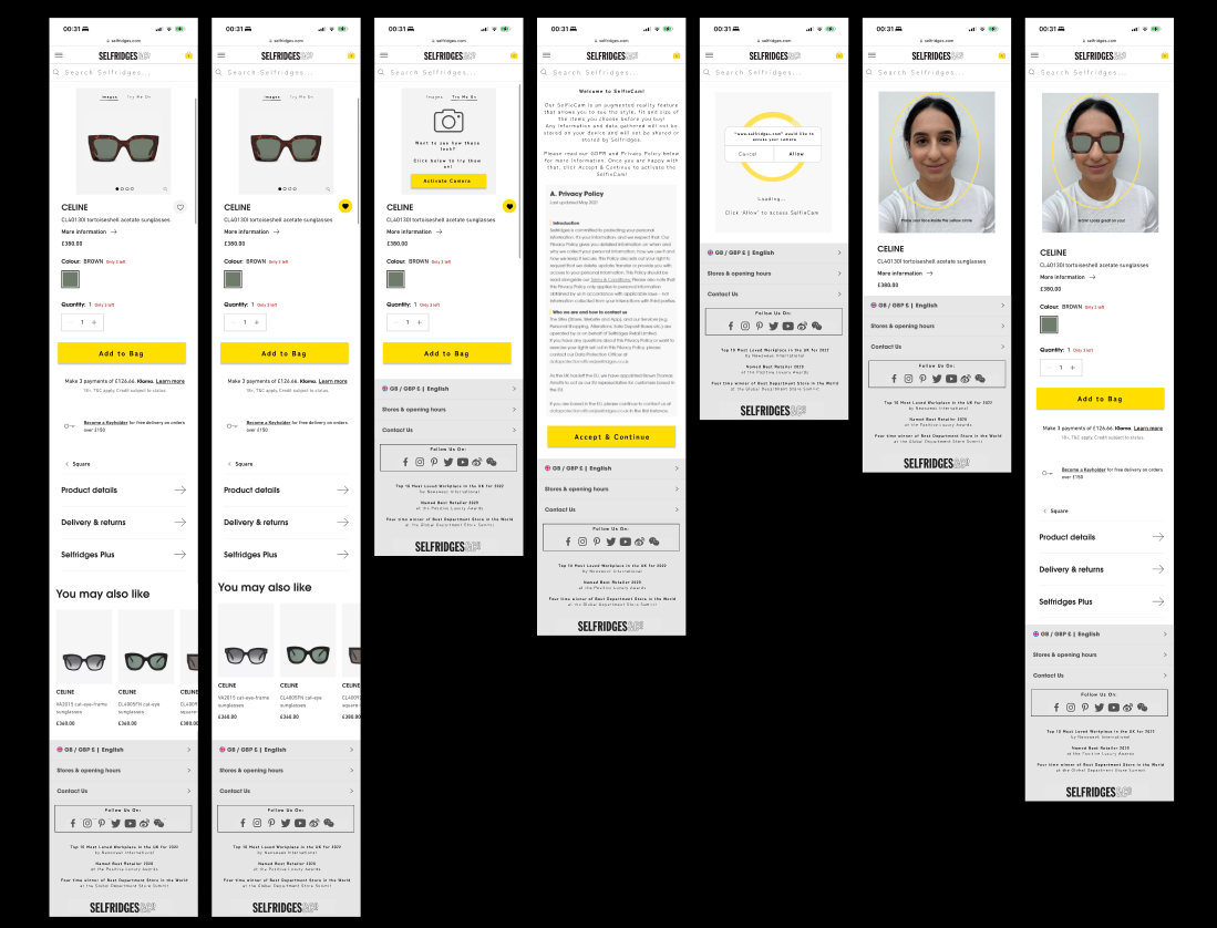
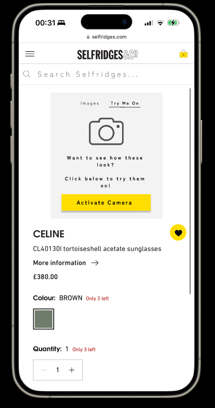
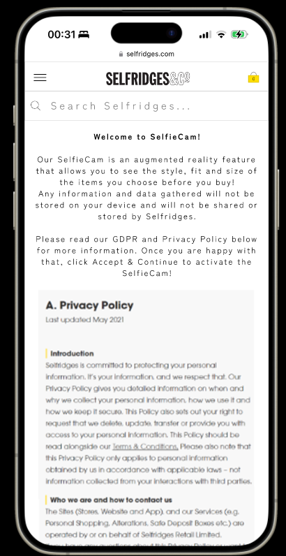
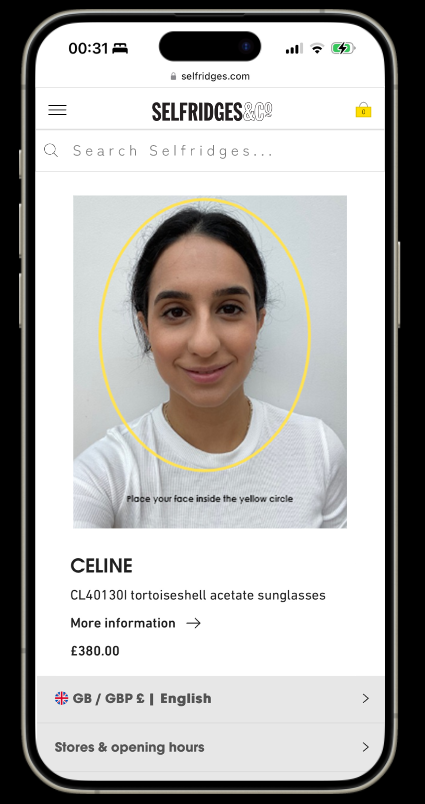
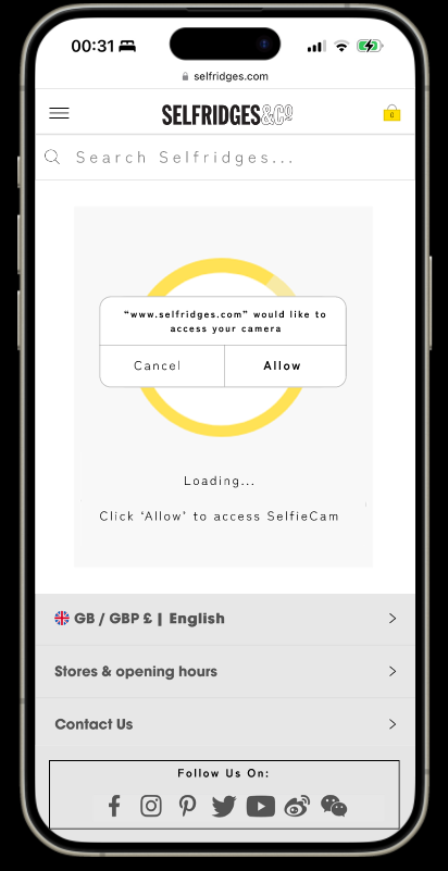
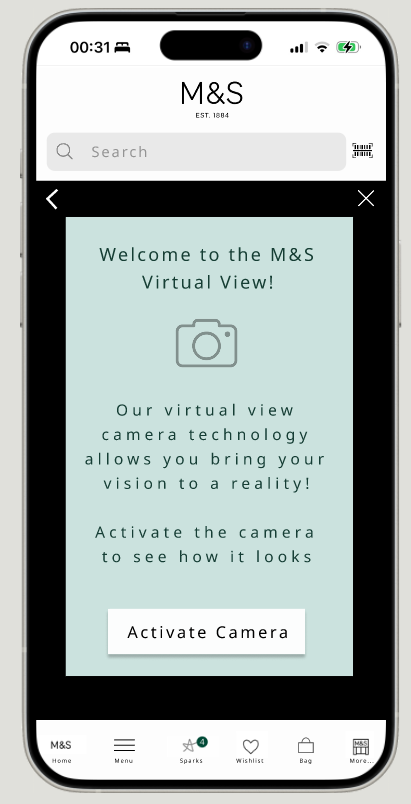
- Virtual ‘try on’ functionalities would be great for overseas consumers and those who tend to shop online instead of instore. Trying on items virtually provides the customer with an interactive and engaging experience and also enhances their buying habits, as it allows them to try before they buy. This is displayed below with a pair of sunglasses and a coined term of SelfieCam.
- All additional recommendations have been included based on user research, to bring the consumer into an interactive world in which the world of tech is moving towards.
Interview Q’s:
Tell me about your shopping habits?
Would you say that online shopping is the ‘way forward’?
What are your initial thoughts on the Selfridges website?
As a customer, what do you think about a more personal shopping experience?
What would make you want to return to Selfridges again?
Would a more interactive experience encourage you to use the site again?


Wireframe Designs

In the Future…
As per user research, an interactive personal shopper and avatar (metaverse experience).
A personal touch of presenting the user with things they may like.
Clear and concise categories for simple navigation.
Scan and shop
More recommendations presented to the company.
Original Screens


Research
Feedback from focus groups:
- Buttons to replace the arrows; the arrows are unclear.
- Light/dark mode toggle adheres to WCAG for users to change their view to suit their needs.
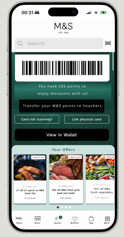
- Consumers noted that they have to manually add their offers. They could only view available offers if they clicked on the tabs. Auto populating these improves functionality saving clicks. Pain points were that most stores had little/no signal making it difficult to add offers.
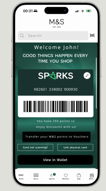
- Loyalty scheme with a points system would entice buyers to shop; when they shop it accumulates points, which would be transferred into vouchers/money off.
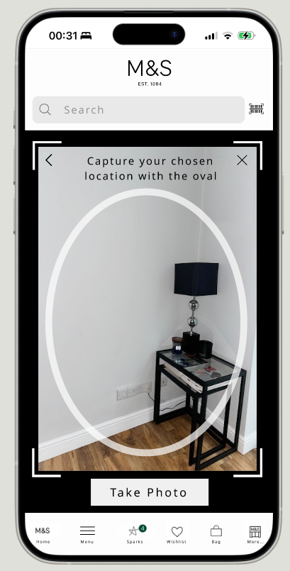
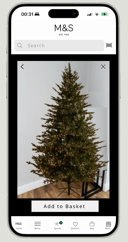
- A virtual view camera would enhance the shopping experience and allow the consumer to visualise their purchase before they commit to buy. It was fed back that this would be a great feature for larger and expensive purchases. It would save opening the items, putting them together and returning. This simplifies a consumer’s shopping experience.
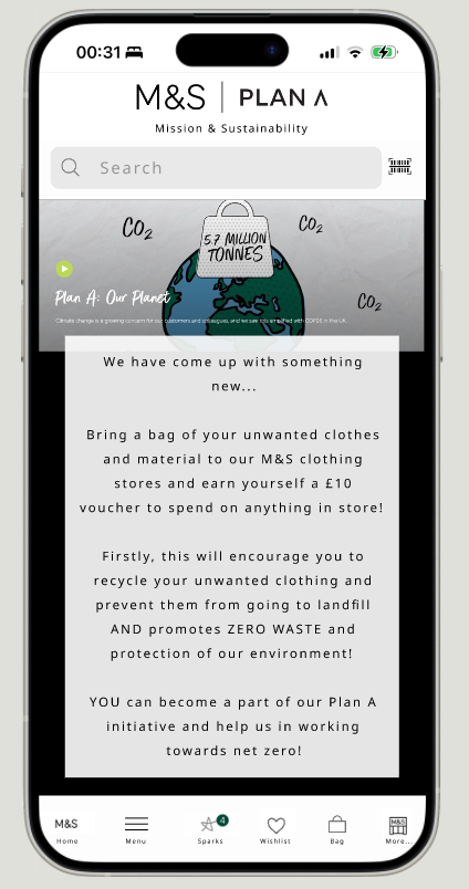
- As part of PLAN A, bringing a bag of unwanted clothing to store is an incentive to encourage consumers to recycle, promoting zero waste! A voucher to spend in store in exchange, changes the way consumers shop and invites them back.
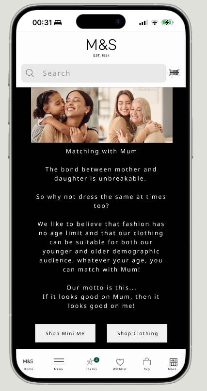
- In keeping with the company ethics, according to TV research, an initiative for a Mother and Daughter to wear the same outfit would create a ‘Mini Me’ navigation showcasing outfits suitable for all ages to match with Mum.

New UI Designs
Interview Questions:
Tell me about your shopping habits?
What are your favourite online shops?
Do you prefer to shop online or in store?
What are your pain points when using this website?
Is there anything you would suggest to improve the website?
How do you think that it could be more interactive?
For a more seamless experience, customer’s need the app; those who do not, have fed back that the user experience on mobile and desktop is not user friendly.
Users tried to navigate through the website and were taken to the home page or losing where they were if they clicked back; this meant that the user would then give up and bounce off the website.
The most common issue was that users did not like to scroll up to view a product instead of across; conventional readability guides are for users to read and view from left to right.
The UIs show navigation from left to right; consumers fed back that this was preferred.
Another feature to include was a ‘review’ section for customers to be able to read prior to purchase.
Functionality to show consumers how to style clothing encouraged them to buy an outfit and know how to style it. The wording of “you might be interested in” has been altered to “style with”. An “as seen on” feature would be interactive, showing how the items are styled by fashion bloggers and members of the general public.

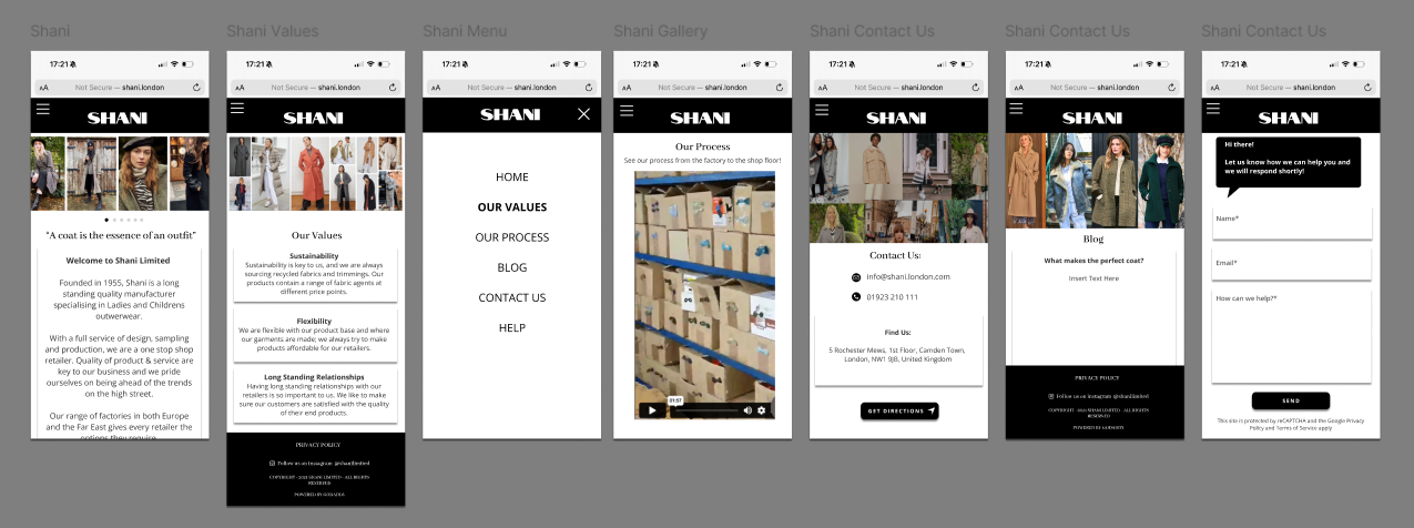
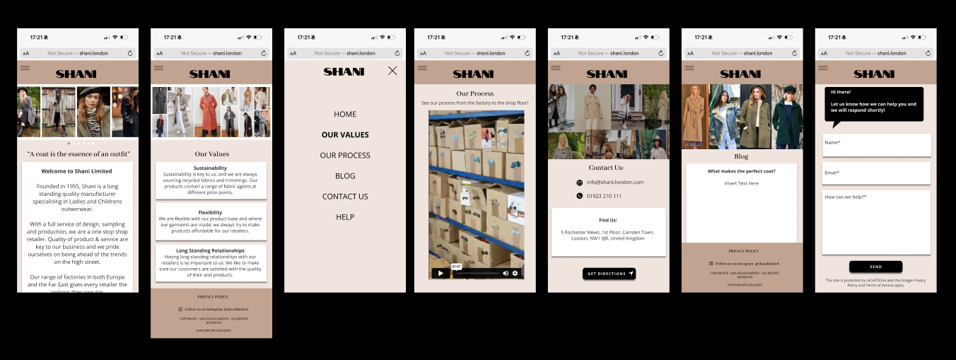
Original UI
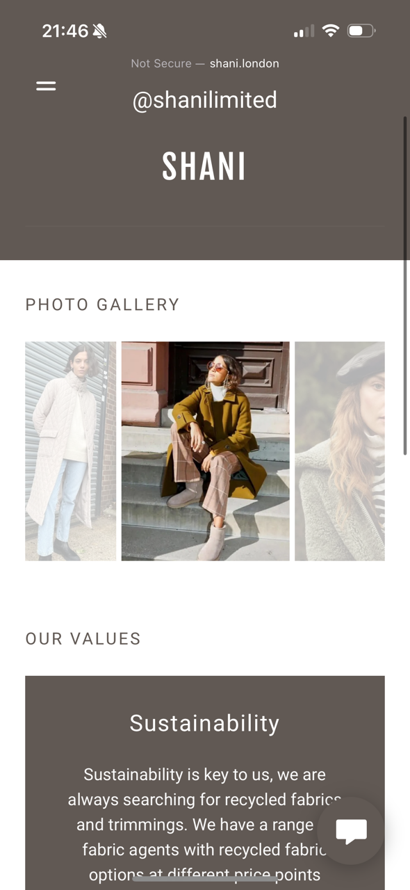
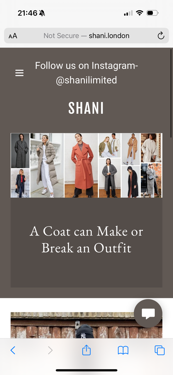
A small business specialising in coat manufacturing wanted their mobile site to have a clean, uplifting UI; users fed back that the mobile site needed more options in their burger menu instead of having the values and a photo gallery on the same page.
The idea of having the photo gallery on a moving carousel on the home page was more effective according to users; they didn’t have to navigate to a photo gallery to see the products manufactured, it was displayed for them on the main page!
Small tweaks to the UI and navigation meant that the user experience on this site was effective, efficient and interactive.
A/B testing showing users different styles for the UI helped them make the decision of which wireframes they preferred.
Discovery & Testing
Future Plans:
Navigate to social pages as these were not clear before.
When the user clicks sustainability, flexibility and long standing relationships on the “Our Values” page they will navigate to pages to explain their core values and show examples of how these values are fulfilled.
Frequent blog posts and as seen on functions increase user interaction.
How to style pages.
Function to add to cart.
Sample sale notifications.
Further user testing to see understand more of what consumers want.
(Unpaid work created for personal development but still shared with some of the retailers )