
Patient Portal
Patient Portal

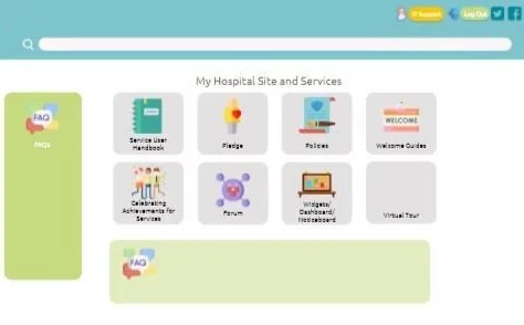
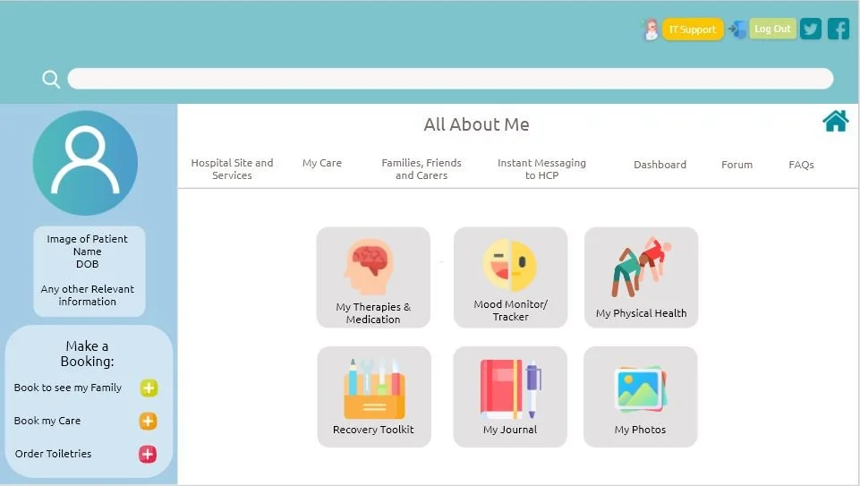
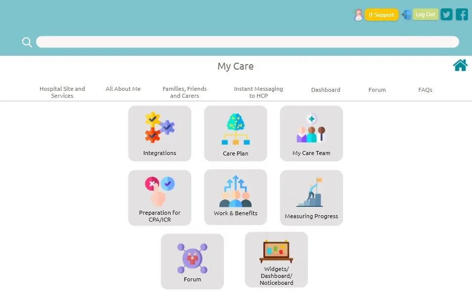
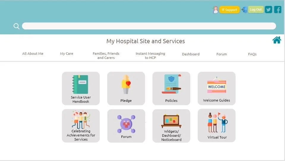
A patient portal was created as patients wanted an interactive and social platform, to be involved in their own care as a resident in hospital. It helped track their progress, manage their own care plans, communicate with peers and staff and arrange family visits.
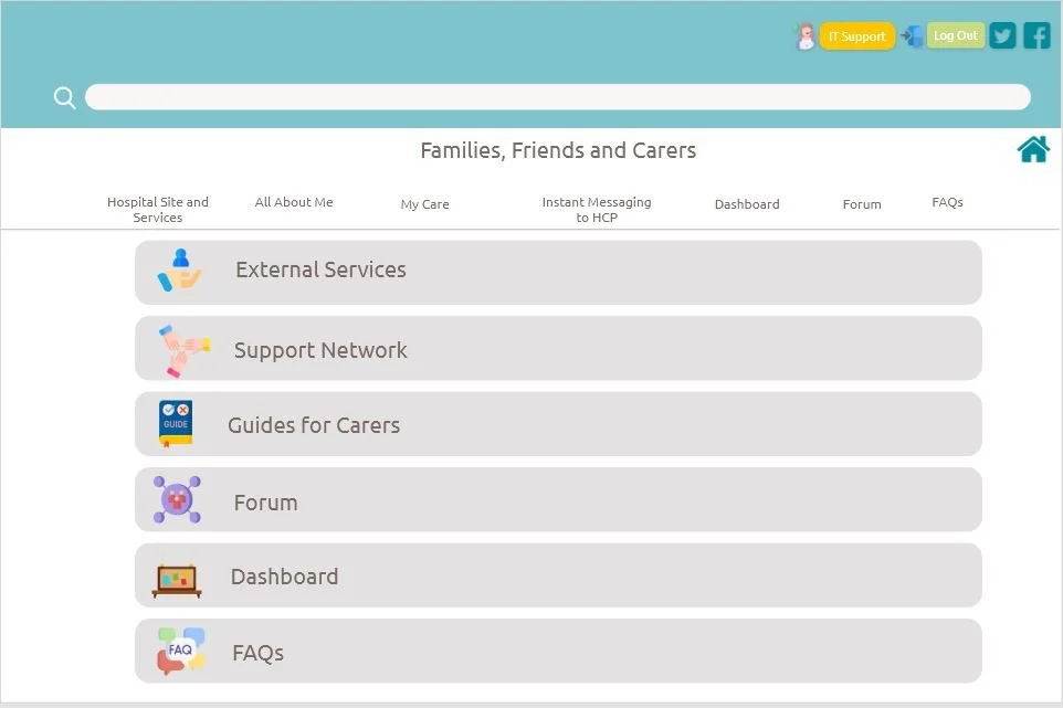
Family members were also able to stay informed of progression; it contained hospital handbooks, policies and guides with a Q&A forum.
The patients voiced that they would prefer visual pictorials as opposed to written affordances. Instead of a back button, a navigation bar at the top took them to the pages.
Overall our users were pleased with this wireframe and found it very easy to navigate.
Please note that any company information has been removed for GDPR reasons.
Typography
Ubuntu
Some colours used at 50% opacity.
Consistent theme of company colour in keeping with marketing guidelines.

Mapping & Prototyping
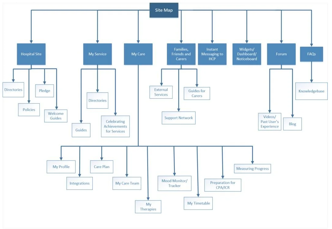

Site Map
Prototypes created on Adobe XD, to understand product placement on screen.
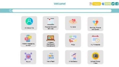

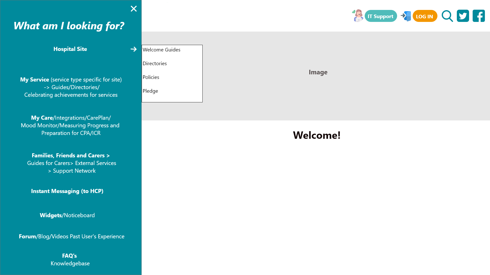
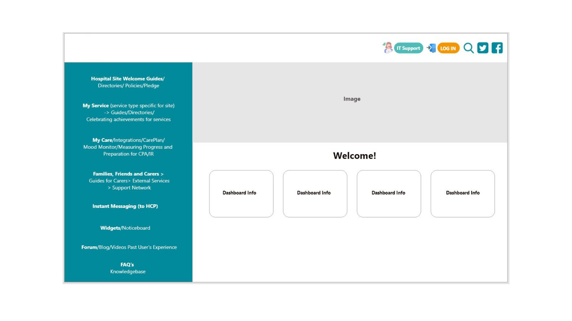
Homepage
Homepage with tile buttons

Homepage with original side Bar Option
FAQs Concept
High Fidelity Wireframes
Patient Portal Mobile App
Prior to the Patient Portal Application creation, this is a design for a Patient App suitable for mobile. This is a more subtle design and iteration compared with the below.

The app contained a profile with information about the patient and a staff list, giving them the ability to instant message them.
The ‘moodometer’ allowed the patient to record how their feelings on a daily and weekly basis.
This information was then passed onto their Healthcare Practitioner and Psychologist to take required action for the patient.
The dashboard showed all information regarding the hospital, staff on duty, family and friend invites for visits and news feed.
Future Plans
Remove pictorials and have text on screen; amend UI with real time images to embody a ‘social site’.
Cosmetic UI changes with buttons (menu) at the top or bottom of screen instead of the pictorials in the middle.
Home icon not required on Patient Portal page.
Simple burger menu, filtering some of the categories instead of having all button affordances on screen.
Have messenger and moodometer as affordances instead of icons.
Further usability testing for iterations.
(Paid Work)