
Vista Health Website
Vista Health Website

An auditory report was initially created; research was conducted as to what patient’s prefer to see when they access the website.
Analytics showed that the private health care website (known as Vista) had an increased bounce rate.
The website underwent cosmetic and user journey changes to create an efficient patient pathway for those who preferred to self refer within the private healthcare route.
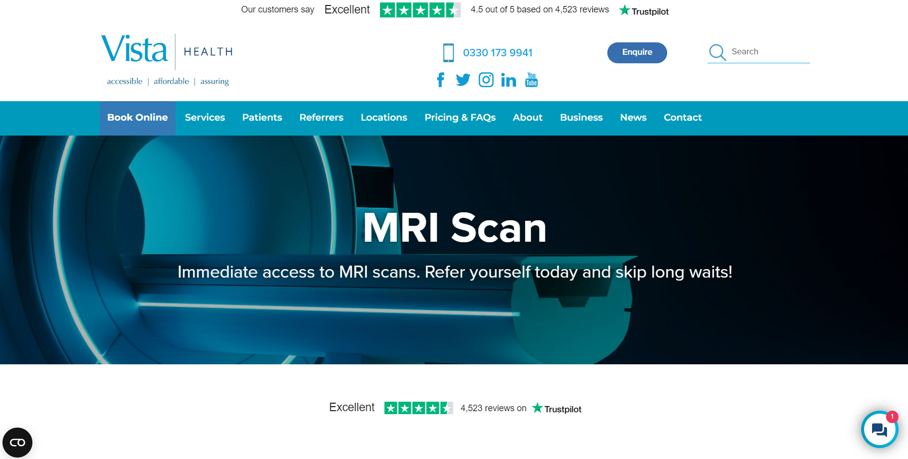
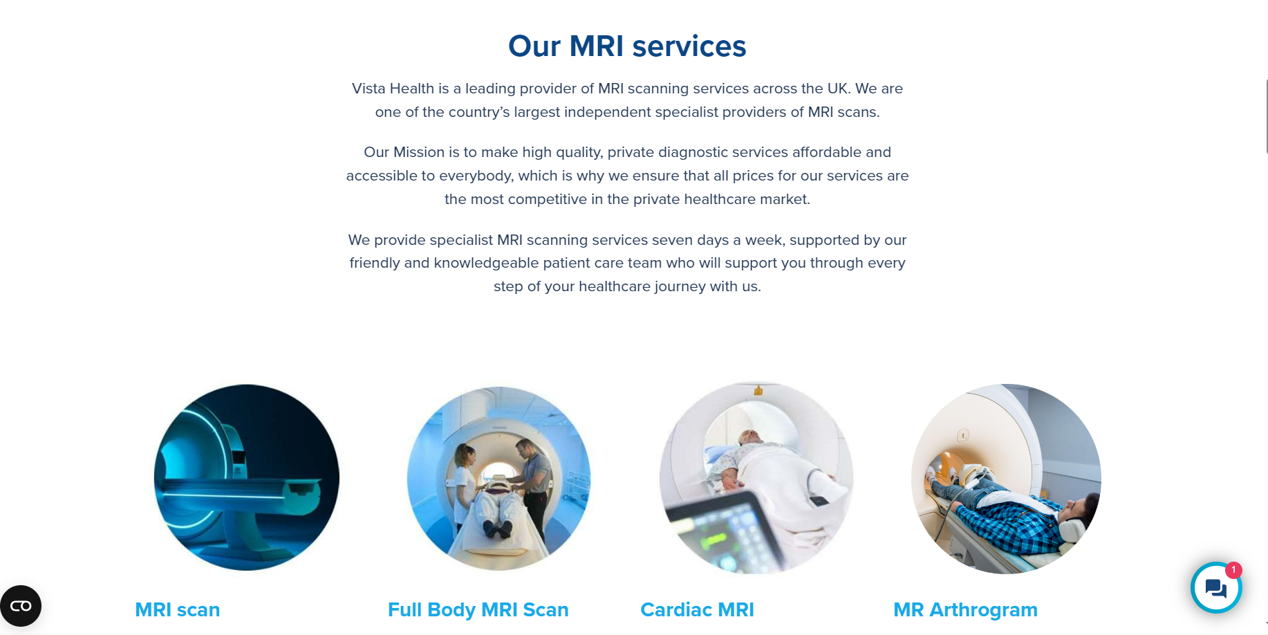
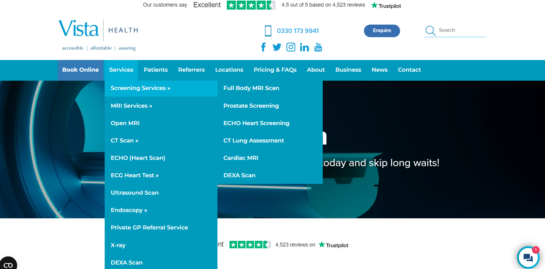
Original Screens


Mint Green: #82D4C5
Blue: #004587
Teal Blue: #1E708F
Light Blue: #EFF7FB
Colour: Most of the company’s medical applications are not colourful or creative; the colours used are kept within company branding guidelines.
Typography/Font: The font used is Noto Sans KR as Figma does not have Segoe UI. The font used for the website is ‘Segoe UI’ from the Sans Serif family, intended to improve the consistency in how users see all text across all languages.
Discovery
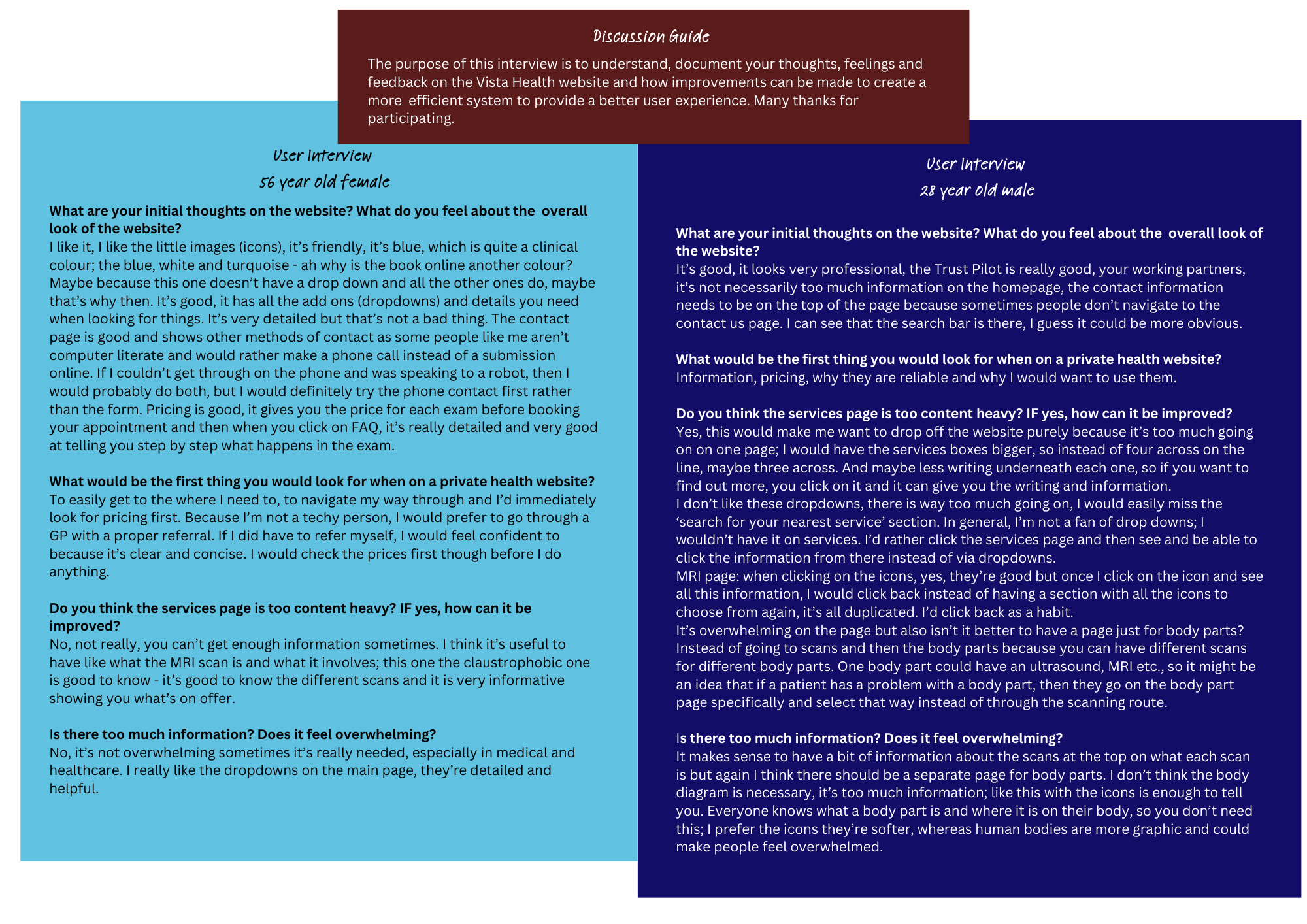
Observational research and user interviews were conducted on patients of all ages, to understand the target audience and ideal persona of who would use the website most.
Research suggested that the average age range of users in healthcare, is between 26-56 years old.
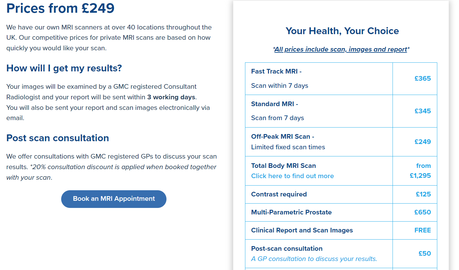
According to the initial report, the higher bounce rate was as a result of the website not being efficient, had a poor layout with too much text on the page, which meant too much scrolling.
The users preferred to call the Patient Referral Centre to book their appointments instead of online. As the call centre phone records are very high, the business preferred to encourage patients to book online and to dedicate more time to an improved patient pathway.
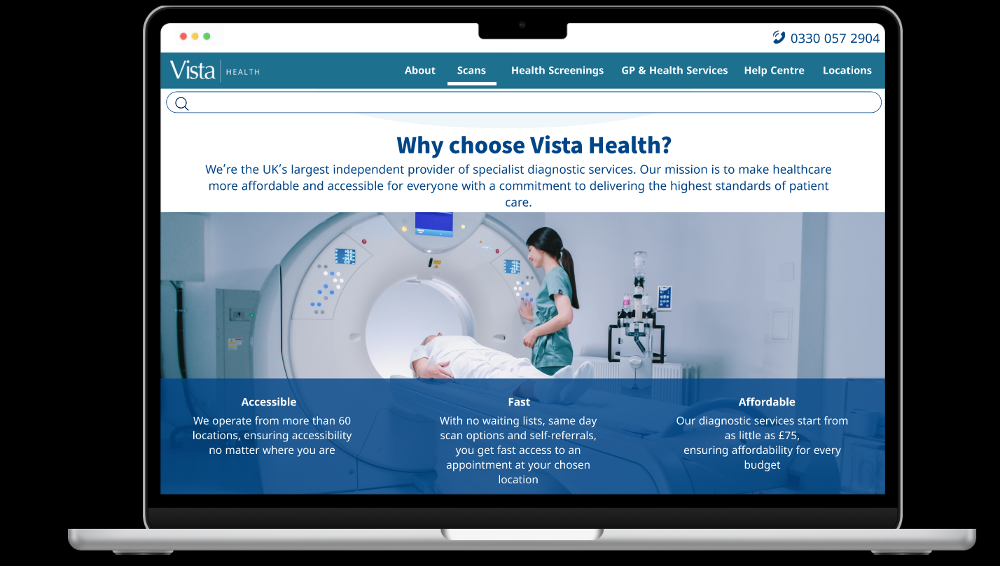
New designs considered that the text should not be the predominant item on screen to not overwhelm the user.
Call to action affordances allow the user to choose their own journey.
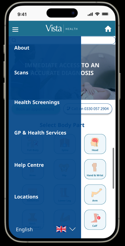
The menu options are kept minimum on the header and drop down information within the menu.
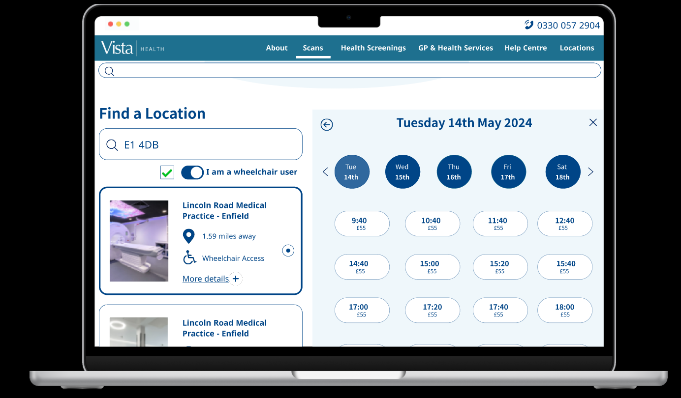
Prices were made clear on the new screens, compared to before, which was confusing for users and resulted in them needing to call for clarification.
Two options are displayed for the user to select wheelchair access clinics; to either use a tick box or toggle functionality (to be discussed with the users on their preferences).
Another issue was that users couldn’t go back or exit their journey. The user now has the option to do so and to continue their booking journey.
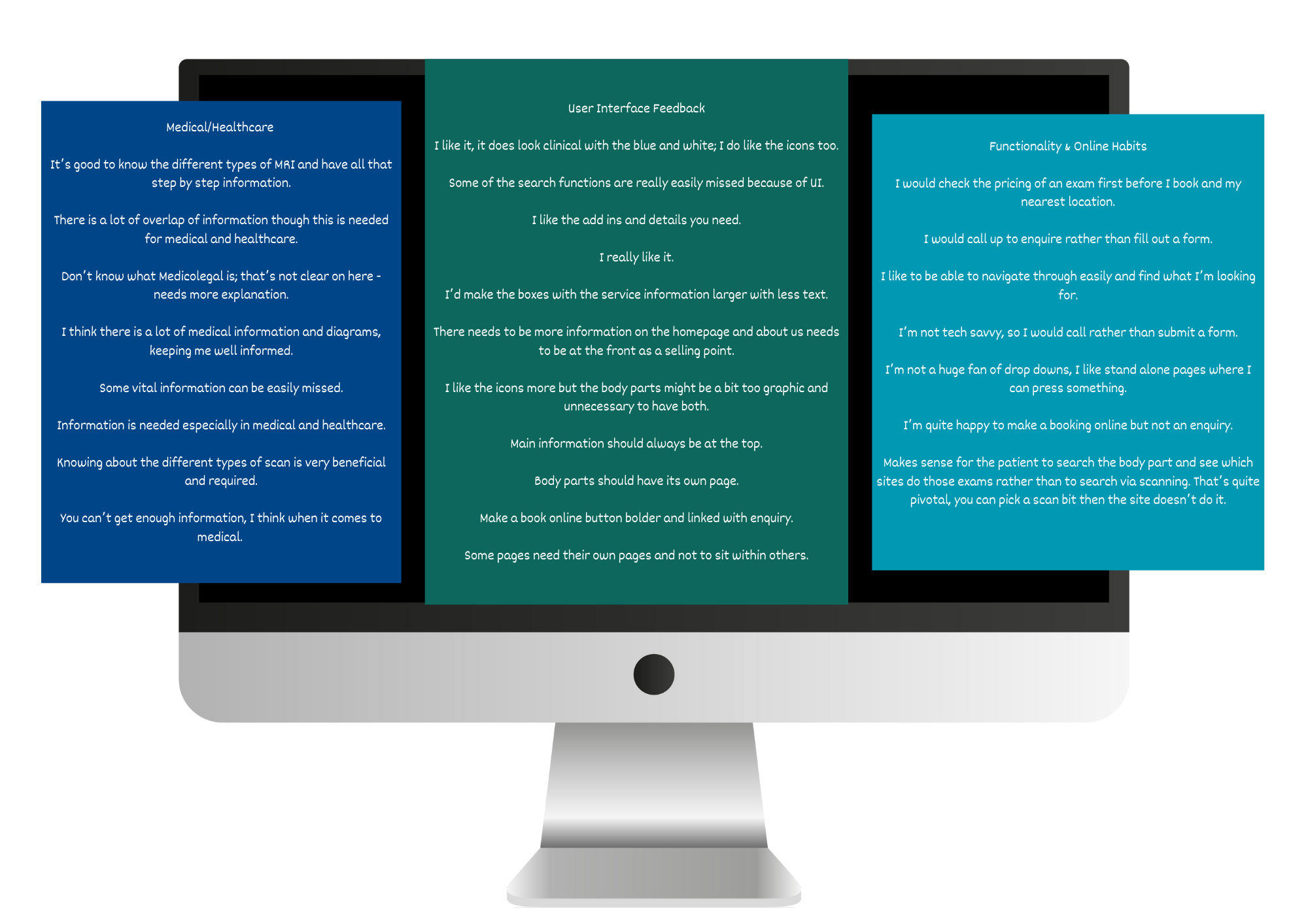
Interviews and affinity maps recorded users’ online habits and feedback
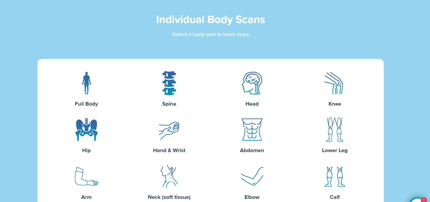
High Fidelity Wireframes (Desktop/Laptop)
The information placed within the images is minimal and easy to read.
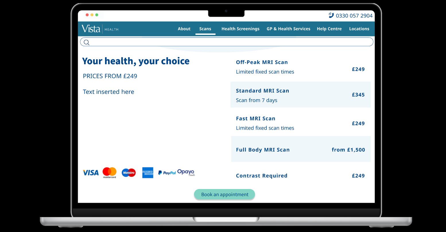
Pricing was made very clear on screen as mentioned in the interviews and compared with the original designs.
The menu options are kept to a minimum on the top bar.
Call to action affordances are clearly shown for users to book appointments and select dates for booking.
High Fidelity Wireframes (Mobile)
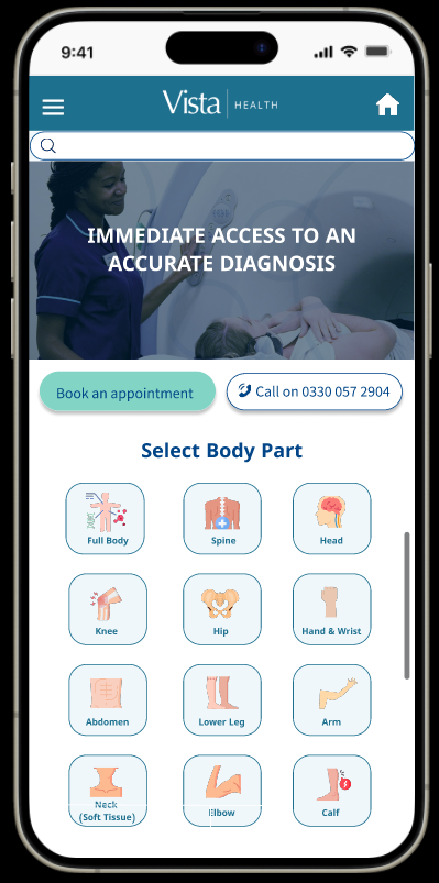
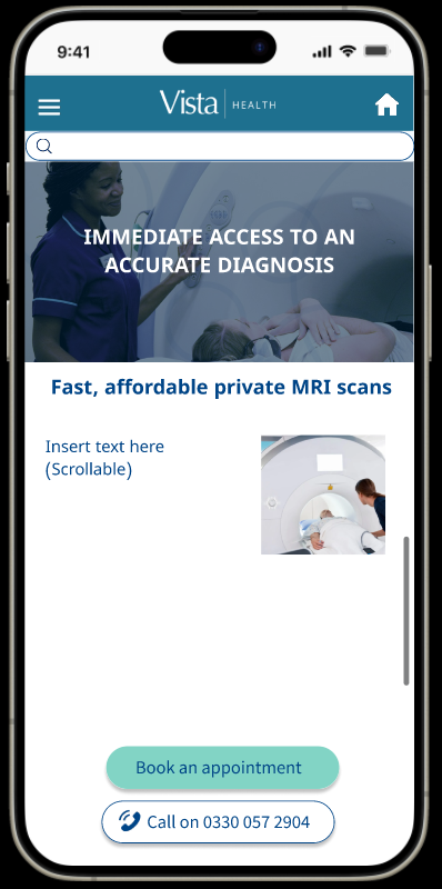
Patients wanted to be able to access the website and book their appointments on the go!
The other wireframes show two varied options; tile image buttons for users to click on
OR
the screen with text, images and affordances for users to book an appointment or call on the go. This would need to undergo further A/B testing.
Both mean the scrolling is decreased. Users agreed this was already clearer than before.
Users liked the tiled option as each body part was visually represented on screen and once clicked on, would provide the necessary information about the scans. The far right option had more text, which was overwhelming to an extent.
Future Ideas:
To improve the user experience further, the booking and submission journey would need additional user research to assist the patient’s who are less tech savvy and would need a simplified process.
Research would need to be conducted after deployment to find out what additional features can be included.
Additional usability testing would need to be undergone after deployment ensuring that users find the mobile and desktop more efficient with a decrease in duplicated information on screen, which proved to be otherwise overwhelming.
(Paid Work)