
WalkMe for Carenotes


Discovery
Surveys
Ethnographic Studies
User Interviews
Usability Testing
Problem Statement
Carenotes, is an application that holds patient information. According to users, Carenotes was not user friendly and too clunky.
Solution
WalkMe is a digital adoption platform that sits on top of an existing application that cannot be modified. It contains pop ups, guidance, tips, and step by step help in order to perfect existing user journeys. WalkMe was the only solution and was implemented to assist the navigation of the application.
Iterations were made on the colour, UX writing and designs from user feedback and to remain consistent with the colour scheme of Carenotes. Fonts and colours used were in keeping with company branding guidelines.
The ‘I want to…’ button, would produce a list of guides/links. Data analytics and insights showed that these tools significantly improved the user experience; the users interacted with WalkMe well and the guides minimised clicks. It minimised human error and created an improved user experience for 5,000 staff.
Of the 4,434 users who had access, 3,566 users interacted with the application.


Designs


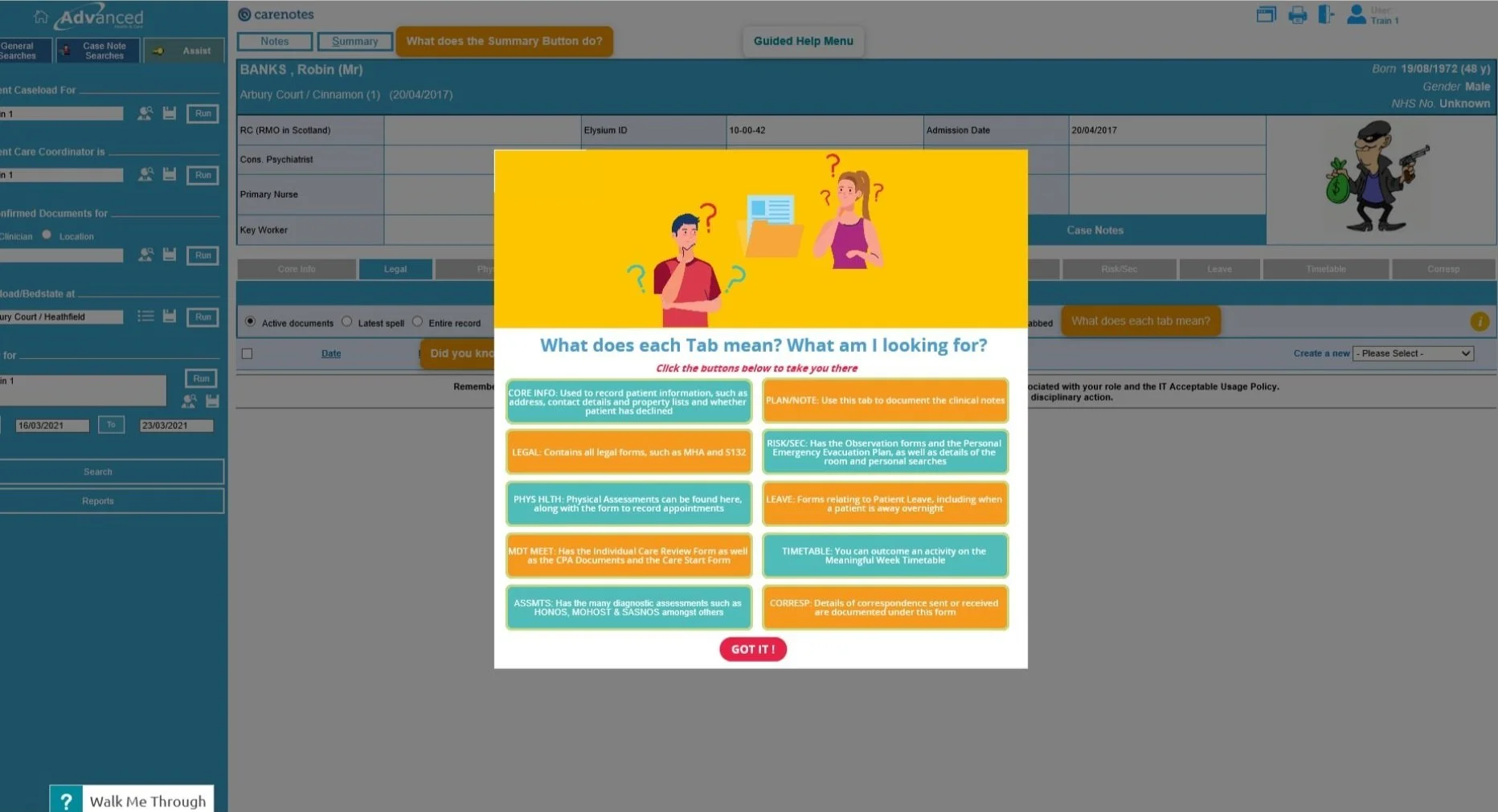
Interactive tools informed users of additional functionalities within Carenotes.
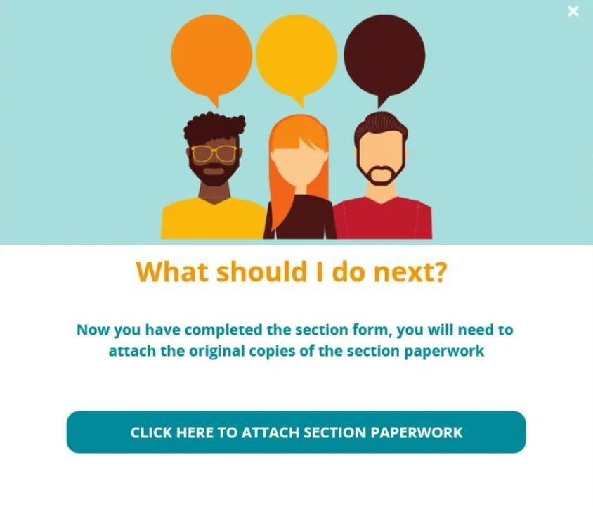
Analysis uncovered valuable documentation was missed. Prompts and pop ups and auto navigation gave users tips/advice on what to include on forms.
Simple buttons took the user to the correct places, automating and minimising clicks.
All WCAG guidelines were considered and users were consulted.
Walk Thru’s provided step by step navigation with clear instructions of what to do next.
(Paid Work)